
With the millions of websites out there, I know you’ve thought you’ve got stiff competition to make your business website successful.
But if you’re reading this post, you’re already a step ahead as it shows you’re dedicated to having your best website! *This is the moment you give yourself a pat on the back. Go ahead…I’ll wait.*
So while there’s no concrete formula or template of the “best” website, there ARE certain elements that can definitely push your site in the right direction.
Find out what things your website should have to be successful. Share on X
As a web designer, I’ve been collecting all these tips throughout the years. And now I’m going to share them with you!
Don’t have time to read all of them? Grab my checklist with bonus items…
Some of the links contained in this post are affiliate links. This means that I may receive a commission if you click on the link and make a purchase from the affiliate. I only recommend products and services that I know or trust to be of high quality, whether an affiliate relationship is in place or not.
Table of Contents
Website Setup
1. Solid hosting plan
Web hosting is the reason how your website is live to the world. So that’s why you’re going to want to make sure your website is on a stable base that can grow in the future. That means you want a web hosting company that:
- Is reputable with good reviews (i.e. a non-EIG company)
- Has plans to grow into (more space, bandwidth, etc.)
- Has great speed and uptime (to make your visitors happy)
- Has great support in case you run into issues
For these reasons, I personally recommend SiteGround to my clients as it ticks all the boxes!
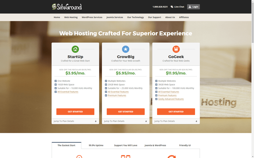
Plans start for as little as $3.95/month and they include a free site transfer from your old hosting. Great support and a great product!
2. Domain name
Nothing says unprofessional more than “yoursite.wordpress.com.” If you’re serious about making money via your business online, then you’ll need your own domain name. Just yoursite.com or another extension. You can get a domain name with Namecheap or GoDaddy. Then they’ll help you integrate it with your web hosting.

3. Lightweight theme
Once you’ve got your domain and web hosting, it’s time to build your website! And the next step is to get a lightweight theme. Because the faster your website, the higher your search rankings can be.
And if you get a theme that’s bloated (i.e. has so many features that take longer to load), then your page speed and user experience can be negatively affected. That’s why I always recommend you choose a lean theme that still lets you do everything you want and add features later (via plugin or code).
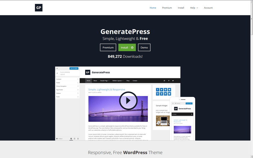
My favorite that I use all the time is the free theme, GeneratePress. It has SEO features infused, with outstanding support. If you’ve heard about the Genesis framework, save yourself $150 and get GeneratePress instead. It’s like the free alternative!
4. Mobile responsive website
In this day and age, your website NEEDS to be mobile responsive. 60% of internet access happens on mobile!
Being “mobile-friendly” starts with your theme’s design. It should state that it’s mobile responsive and you can test it out in your browser window or phone to make sure.
Then after you finish designing your website, you will need to test your own site out to make sure it’s all looking good on different screen sizes. A lot of page builder plugins have mobile options to make it easy to change sizes on mobile, so take advantage of that if you don’t want to use mobile queries in CSS. And don’t forget Google’s Mobile Friendly Test to check for mobile responsive issues!

Design
5. Logo
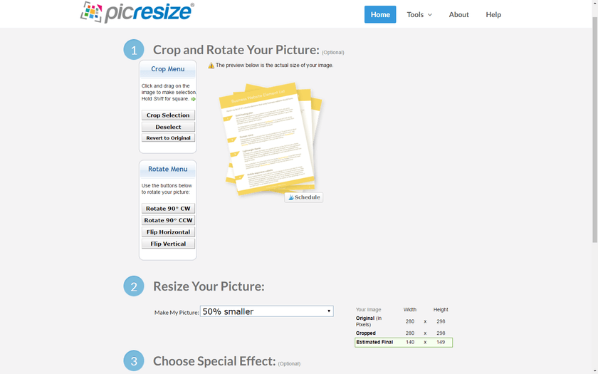
A professional business needs a professional look. And that starts with a logo. Make sure it’s the right size for displaying on your website. If you need to make it smaller, use the free online tool, PicResize. Also, make sure any background is removed if over a non-white background.
6. Favicon
A favicon is a small symbol that is displayed on your tab and in other applications. It’s usually a symbol of your logo or branding, and also helps for SEO purposes. WordPress has a section for you to upload it in Customize > Site Identity.

7. Color scheme
Your website should have a unified color scheme. You use the same HEX color codes (like #CEA453) consistently and stick to a pre-designed color palette. Too many random colors make it look unprofessional.
Too many colors can make your business website scream unprofessional. Share on X
8. Font scheme
Like a color scheme, you should have a font scheme, where you know how each heading will be on your website and you stick to it. You usually have up to 6 default headings, a paragraph text, and/or an accent font style. Think about the font, size, color, letter spacing, capitalization or italic styling.
9. White space
Your website needs breathing room in the form of “padding” or “margins” around sections in your website design. The more elements are cramped together, the less sophisticated it looks. Think about a store-front window. If you cram it in with so many items, it looks messy and you can’t really tell what’s important or interesting. On the other hand, if your store window only has a few items, with good spacing between them, people can instantly see and appreciate the items because they stand out.
10. No home page sliders
A few years ago, sliders were among the latest web design trends. Website owners loved them because you could display multiple things that you wanted shown off. However, for most people the love wasn’t mutual. We live in a fast paced world, and many of us don’t want to wait for your slider to learn what your website is about.
In fact, sliders have a really low conversion rate. That’s why it’s best to ditch your home page slider and have a stationary welcome blurb about your site. You’ll improve your page speed and if done right, instantly inform your readers what your website is about.
11. Home page clarity
Which brings me to my next point…Your home page should tell the visitor explicitly what you, how you help, etc. It should also have a clear path you want the visitor to take. If your copy is vague, people will be wondering what you do and if they don’t have the energy to find out, they’ll leave.
12. Calls to action
If you want your website to be successful, you probably have goals for your site. Like booking an appointment, buying a product or service or even picking up the phone to call.
To have the best chance of having this happen, you want to make sure you have distinct calls to actions on all pages. Tell your visitors what you want them to do and make it convincing to do. There’s so much more about creating calls to action, which you can read here:
13. Uncluttered sidebar (if using one)
To have or have not a sidebar…that is the question. And it’s probably a question you should test eventually. One side of the field says that sidebars distract from your blog posts, which lowers conversion rates. The other side says that placing opt-ins there increases conversions.
It’s up to you to decide if you want a sidebar (you can see which side I’m on). But if you do use it, make sure you keep it clean and organized…not messy and bursting with info, graphics, links, etc.
14. Helpful 404 (error) page
When people make a wrong turn on your website and end up on a broken link, your website often shows an error page or 404 error. Usually it says, “this page can’t be found.”

But for visitors, seeing that can frustrate them. To make them happier, you can offer an apology and help them get to where they were going with a search bar. You could even offer your opt-in again or popular posts to give them value.
15. Social proof
To give the most credibility and buying incentive, make sure your website has “social proof.” These are elements that show that other people have tried and approved of your business or products. Some social proof examples are “featured in” logos, reviews, testimonials, tweets, Facebook comments, etc.
16. Organized menu
When you go to a new website, odds are you check out the menu to see what’s available. To make it easier on the visitor to make a choice of where to go, keep the amount of top links to a minimum. You can always go deep with drop-down items! Because often the more choices you give, the more people get overwhelmed and don’t choose any.
Make sure the structure is organized, where similar pages are grouped together. And keep the menu labels as simple as possible for people to find what they’re looking for as fast as possible. It takes more effort to comprehend “Let’s Chat” than “Contact Us.”
Design Tip:
Also make sure that the current page in the navigation menu is distinct from the others. You can try changing the color, adding an underline, etc.
17. Home link in menu
You will want to make sure you have the “home” link as the first one in your menu as many people like seeing that and gives them a sense that they can return home. You might think that people will know to click your logo to go to the home page, but actually not everyone knows that. They’ll recognize “Home” though.
I’d also recommend having the “About” page right after that, as it’s often the 2nd most visited page on your website and you want that within easy reach.
18. Search facility
A lot of people still like to search when they get to a website, so make sure you have an easy search facility, either in the header or footer of your website.
19. Copyright
Have your copyright in your website footer that’s up to date. That gives visitors confidence that your business is still “in business” and current. Because if you’ve come across a business that had a 2012 copyright, it would give you some doubt to whether they were still around. And it offers some protection, as it means you own your content.
20. Legal pages
If you’re operating a business via your website, you’ll want to make sure your site is complying with the laws. You might need disclaimers if you have affiliate links, or a privacy policy if you collect email addresses or other personal info. And a terms of use page is a good idea because it’s basically your website’s rules and can limit your liability in case of legal disputes, because you’ve stated your terms.
21. Contact info
Prominent contact info will also display credibility and trust that you’re a legitimate business. And it’ll make it easier for people to contact you! Some good ideas are to place a phone number in your menu if you want visitors to call you easily, and have your contact links in the footer. And just make sure you have it all again in your “Contact Us” page.
Having prominent contact info on your website signifies trust and credibility. Share on X
22. Blog
Blogs are a great idea for your business website as it shows your expertise. If people are looking to buy a product or service, they want the best in their price range. And if your company shows how knowledgeable you are with your blog posts, it gives customers trust that you can deliver what you promise and provide a fantastic product/service.
Blogs are also great to improve your search rankings and potential customer reach!
23. Social sharing buttons
So if you do have a blog or pages you would want shared, make sure you’re using the right buttons to do it! This will allow easy sharing for more reach.
[wpusb]
I’ve written a post that covers all this here:
Integrations
24. Google Analytics
In order to make the most sales from your website, you’ll want to make sure you’ve got Google Analytics (GA) set up correctly and installed on your website. This can be done by placing the GA code in your website’s header (either the child theme header (not the main theme), a dedicated place within the theme, or a header/footer plugin) or using Google Tag Manager. There’s also a GA plugin, but you shouldn’t need it if you install the code and can visit GA online. The more plugins you have, the slower your website can be.
25. Email marketing
You might want to collect emails to do email marketing because it’s still one of the best way to get sales. So you’ll want to make sure all your forms and opt-ins are correctly integrated with your email marketing provider. My favorite is ActiveCampaign and that’s what I use in my business.

26. Social icons
You also might want to integrate your social media networks on your website. You can place social icons and link them to your profiles. Often it’s already part of your theme or you can use the free FontAwesome icons. And you can customize your icons look, so they’re in the right color scheme as your brand. Having social icons also displays credibility because in this day and age, if your business isn’t on social media, it can come across as sketchy.
27. Security plugin
And on the backend of your website, you’ll want to make your website as safe as possible against hackers. I have a free email course that covers how to protect your site if you haven’t signed up here. But you will want to install and configure a security plugin, like Wordfence (free).
28. Backup plan
Also discussed in my course, you’ll want to make sure you don’t lose your website. Having a backup plan is so important and you’ll want to do it right. Don’t rely on your host’s 30 day backup, because you might not notice a problem within the 30 days. Having an automatic backup plugin like the awesome UpDraft Plus can be helpful, but knowing (and regularly doing) manual backups is the best safety measure you can make because you’re not putting your website in someone else’s hands.
SEO
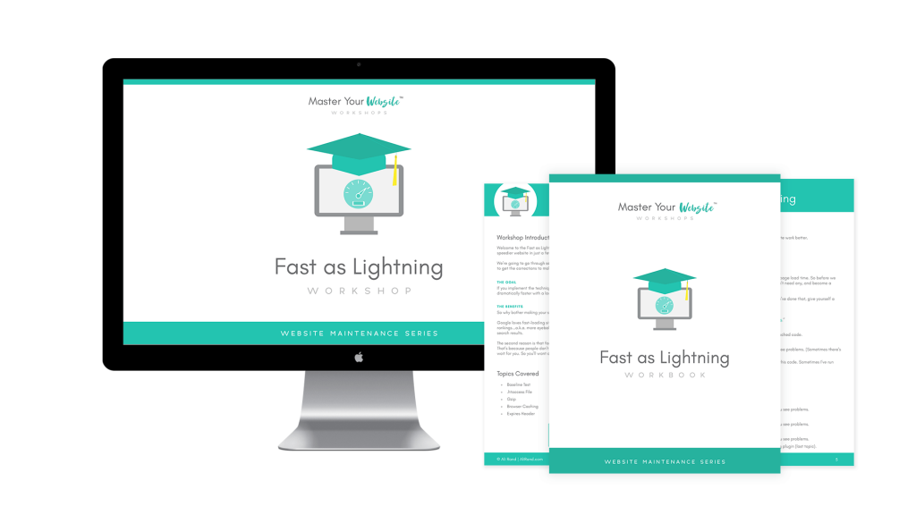
29. Fast loading website
Increasing your website’s speed isn’t hard to do, but it makes such a powerful impact! Google rewards faster sites with higher rankings, and visitors will love you for it!
I have a short workshop where you can easily make your website faster and get more subscribers here >> Fast as Lightning Workshop.
30. SEO plugin
To boost your SEO, start with an SEO plugin. It’ll allow you to insert your title tags and meta descriptions, and give you options to upload social featured images. It’ll also create a sitemap for you!
I’m loving The SEO Framework plugin, but Yoast is also a good choice.
31. Set up nofollow
On pages you don’t want Google to index, you’ll want to set the SEO setting to “nofollow” or “noindex”. Also do this on archive pages and categories, as it’s repeating info. Affiliate links should also be “nofollow.” You can do this by adding rel=”nofollow” in the HTML of the link.
32. Permalink structure
The permalink structure is how your website’s blog posts or pages is displayed as a URL. For example, “alirand.com/blog-post-title/” instead of “alirand.com/07/blog-post-title/” or other variations. It’s best to have your structure be short with keywords in the URL. You can change this in WordPress settings. If you change existing posts, you might need to do some redirects if you still want people to using the old URL to find your newly-named post.

33. Subheadings
Your website should also make use of headings tags in the right order. This helps screen readers know they’re following your website in the right order. Also, keywords in your headings helps your SEO and more headings in general makes it easier to read.
34. No broken links
Broken links happen when the page the link was referred to is no longer available or deleted. When you have these broken links on your website, your visitors can get frustrated and leave. So it’s important you regularly scan for broken links on your site via a free resource, like Dead Link Checker, and then fix them.

35. No email addresses in plain text
A good way to protect your email from bots and spammers crawling your site for email addresses is to make sure on your website it never shows up as plain text (i.e. without the @ symbol). You can display it as hello(at)alirand.com, just make sure the @ symbol isn’t used.
36. SSL
Having a secure site is also a good way to boost your SEO. Some webhosts offer this for free, like one of my recommended hosts, MDD Hosting. Others only for the first year or so. If you haven’t built your website out yet too much, it’s a good idea to make the switch. If you already have an established site, it will be a little more work on your part to make sure everything looks ok, but it’s worth it.
Accessibility
37. Color scheme for accessibility
In order to reach the most visitors, you might consider having your design pass accessibility standards. This can help people with visual impairments see your website better. You can test your colors for buttons and overlays for passing accessibility standards. If it doesn’t, people who are visually impaired can have a hard time reading your buttons and text.

38. Avoid using URLs as link text
Instead of putting the full “https://www.alirand.com” in your copy on your website, make sure to link it instead like this Ali Rand. For people using screen readers, this will make them a lot happier.
39. Descriptive links
For screen readers, just having a “Click Here” or “Read More” button doesn’t help them know what you mean. So make sure they’re descriptive like “More fitness articles” instead of just “read more.”
40. Keywords in question headings
Following the same thread, if you have a lot of questions, like in a FAQ, make sure the keyword is the first word. Like “Website Maintenance: What is it?”. This way screen readers can find what they are looking for faster, without having to always listen to “What is…” first.
41. Download links
If you want people to directly download something off your website, make sure you explicitly state that the link activates a download. Although it’s best not to directly link to downloads at all, for no unwanted surprises.
Conclusion
So now you have over 40 ideas to make your website better to convert more customers!
Every little bit helps, even if you can’t see the impact right away.
And if you want more tips and a list to keep forever, click the button below to get your Website List…
Some of the links contained in this post are affiliate links. This means that I may receive a commission if you click on the link and make a purchase from the affiliate. I only recommend products and services that I know or trust to be of high quality, whether an affiliate relationship is in place or not.
Got a second? Leave a comment below with what things you found necessary for your website. Or are there things you don’t think matter?
And if you’ve found this post helpful, please share it with your friends so they can also make their website successful!


17 thoughts on “41 Things Every Successful Business Website Should Have”
These are some really great tips for new bloggers. I had to learn the hard way a few years ago. I know I need to get a little more consistent with making my blog more readable to people on screens.
Hi Nakeya,
So glad you found these tips useful. And yep, we all go through learning the bad and the good on our own too! And at least you know what to focus on, so I’m sure you’ll get there for mobile.
Great content Ali!
Thanks Vanessa!
I was literally working on setting up my website when I saw this on Facebook. This stuff is gold! I’m going to implement a lot of these suggestions right now.
I love perfect timing! Thanks for checking this post out, Kate!
Lovely tips. Will be sure to implemement what I have missed on my Jewelry Blog!
Thanks Rashida! Glad I’ve helped fill in some gaps.
This is so comprehensive and ideal to keep in mind as I build a new website over the next 2 weeks for my Unbridely Live event. Thank you, Ali! 🙂
Ooh exciting, Camille! Good luck with it and hope this will help you out with your new website!
Some good tips, Ali. Though my website has been up for awhile, I found some useful information here. I might add one thing which I’ve found undermines the credibility of the site owner all too frequently: proofread your copy, then proofread it again, or, if you can, hire someone to proofread/edit what is going out to the world with your name on it. Nothing screams “unprofessional” like misspelled, misused, or worse, omitted words.
Hi Sheri,
Yes, you’re totally right that spelling and grammar is SO important! And it definitely raises a red flag for me to see multiple spelling mistakes.
Thanks for sharing!
Hello Ali, phenomenal post!
I just did a post on business website that totally complements with yours. Mine has different approach, as I focused on why a freelance business should have a website.
I’m planning to do another on websites for freelance businesses, and yours is great so I’m thinking on linking your post from mine!
Hi Andres,
Aw thanks so much! And yes that is an important thing to have for a freelance business. Especially in this day and age! And thanks for the link, you rock!
Ali, you share very useful information here, thank you! I found a few tips to use on my website, improving readability for screen readers among others.
Thank you Tayana! So happy you got value from this post. And that’s awesome you’re going to help improve readability, as it’s something people don’t think much about for their websites!
Hey Ali,
We also recommend Siteground as one of the best web hosting.
I noticed that you have something against EIG as well.
After finding so many bad reviews of the group we at cloudwards.net decided to do some investigating.
The article will be ready by the end of this week. If you don’t mind I’ll pass it over 🙂
Comments are closed.